
Energiser
What makes the following characters appealing?
- Cartoony style
- simplistic looks
- vibrant colours
- kind facial expressions
Extension – I believe these characters would actively raise awareness for healthier lifestyles by advertising fitness and food.
The Appeal behind Minions
The Minions is notoriously known to be lighthearted and humourous, this is due to its simplistic styles and its ability to create humour without words, using only the physical space to generate ideas. Although it certainly isnt appealing to everyone, it cannot be dismayed that the idea behind it is ingenius due to its ability to gather a large majority of people from toddlers to the elderly. The key aspects that make it so appealing to young children is the creatures lack of intellect and intelligable language. This allows for people universally around the globe to watch it and not have to worry about trying to understand the language used. This allows for the characters to be animated solely on their personalities, which is much more memorable than words. The minions wacky personality creates a symbol that is universaly known, If you were to show it to almost anyone across the globe they would be able to tell you what they were.
Target for lesson 1 – to produce a jumping and running animation with the characters provided.
At the end of the lesson, I was able to produce a simple running animation using the potato character provided by St. Marks Meal, Below is the GIF produced

After assessing the animation produced, I believe I could improve it by swaying the arms a bit, obviously keeping the ecstatic emotion but with a bit more character. I could have also imported the character into photoshopped and tweaked it to have eyes and a moving mouth.
Action plan
For my next steps, I will attempt to create a 3D model as well as an animation that will be implementing the features that St Marks have requested. My smart target goes as planned
S – To create a 3D animation for St. Marks meals
M – Take constant screenshots and review of current progress
A – Prioritise the modelling first then allocate a lot of time in animation
R – Ensure that the assets used are suitable for St. Marks
T – First few sessions spent on modelling, the rest is spent on animating.
Who are St. Marks Meals
St. Marks Meals are an organisation that is focused around ensuring that children living in poverty don’t go hungry. They do this by delivering boxes of meals to schools and community centres for parents and children alike to collect, ensuring that they get all the substance and nutrition as possible.
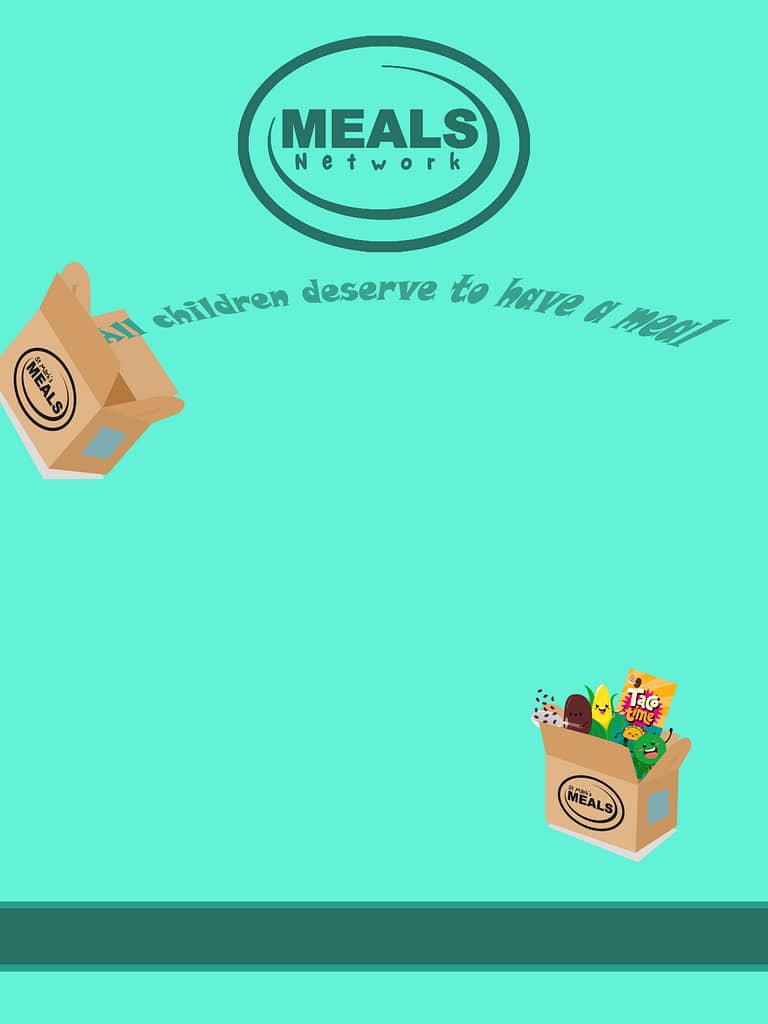
As a challenge, we were tasked to create a poster for st. Marks meal, I followed the colour scheme used on their website as well as using a font style suited to their website. I know it needs to be improved by having information on it such as contact information.
I believe that if I had finished my poster it could have been used officially as it was in line with their theme and what their goals are
The Website
When looking at the website, I believe they could improve it by improving the user interface, having easier tabs to move to instead of sometimes having to scroll to the bottom to return to a page adds unnecessary effort and creates issues for users who may decide that its too much hassle and stop reading into it.